


Indecisive tonality
The battle between color and black and white

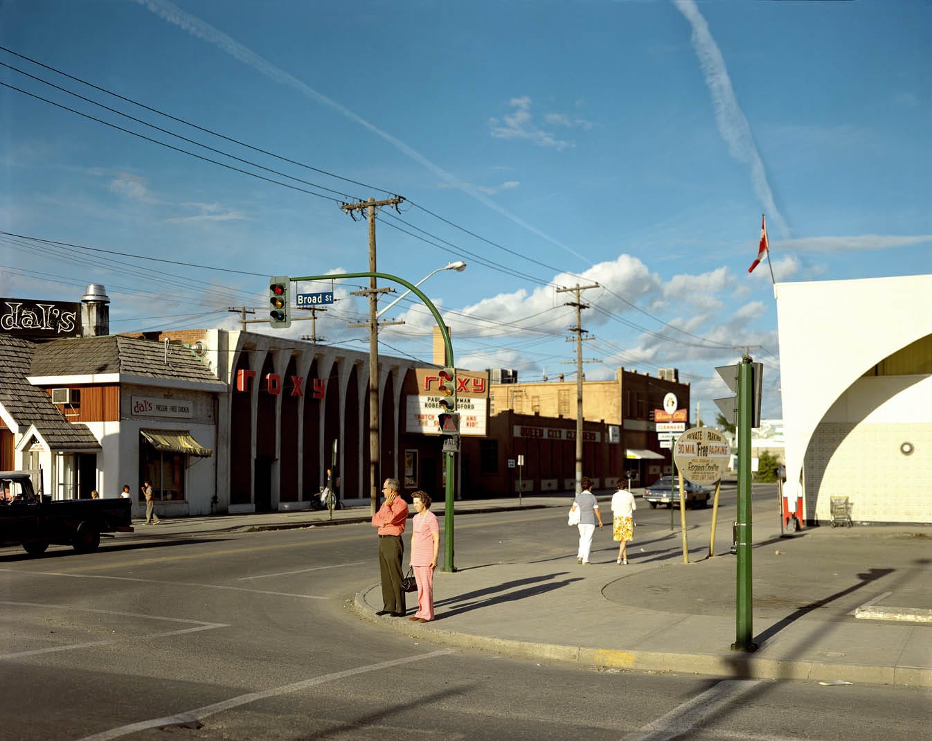
Years ago, when I was in undergraduate and shortly after, I was making work almost exclusively in color. I was working in film and digital, depending on funding and time. The only times I would work in black and white were when I had black and white film — which wasn’t often. My fridge was stocked with Portra and Ektar and whenever I was able to get a box of Pro400H or two. I was dead-set on the color trajectory. It was also around this time that I was looking at the works of those artists in photography’s canon working in color in the 70’s and 80’s. This included some of the biggest names in photo (and art as a whole) — Stephen Shore, William Eggleston, Joel Sternfeld, Joel Meyorowitz, and so on. I was watching interviews, reading analyses, buying their books and learning about photographing the contemporary landscape (of the 70’s, 80’s and even today for those still actively making new work). Color was just what made sense in my early 20’s because of those that I was looking at.
Most people who swear by color, including most of these artists I was studying, often defend their choice by stating “color is how we see the world.” It’s true, of course, at least for most people. The “world as it comes at you” as Paul Graham would say, is color. These artists formed my understanding of how to compose a scene, how to understand the forms created by color, how to isolate a subject and create a narrative. But over time, I found that color isn’t always the best backdrop for these tools. In fact, these tools are separate from the treatment of color vs black and white.
In graduate school, I continued working in color. I shot both digital and film, gathering a pool of hundreds of photographs that would turn into my thesis exhibition Perennial and book showing 61 color photographs. Color felt right at the time, but looking back, I’m almost certain I would have been able to create a better series in black and white using the same photographs.
I recently learned from a friend that there are some artists that shoot color film but render the images in black and white — a cardinal sin among the purist, hyper-traditional crowd of photographers. One of these artists is one of my current favorites working today — Kristine Potter. her work Dark Waters had an effect on me that I wasn’t expecting. Of course, I already enjoyed the photos for what they were when I first saw the work. As I continued studying the book, the entire object became so much more interesting and emotional. But having known that some of the photographs were shot on color film but rendered black and white for the project made me wonder what would this look like in color?


It’s that dangerous question — one that plagues my studio practice. As I’ve been making work post-MFA, I have been continuing making work both digitally and with film, and I’ve resulted in exporting my digital photographs as both color and black and white. I compare the two, I like both renderings of tonality, and I set myself up for a stalemate, indecisive about how to proceed with the image. Part of it is also related to the fact that my current work doesn’t have the bounds of a dedicated project (yet). I have ideas in mind, but there’s always the chance those ideas merge, or they get thrown out, or they change entirely.
I remember talking to one of my friends who is a photography curator that I am “sick of color.” What I meant by that at the time was the never-ending battle about how to control the hues, the saturation, the overall color control of a scene. This was especially present in my MFA work. The two weeks after my MFA graduation, I set off to make work in Illinois around the rural landscape surrounding my hometown. I shot 14 rolls of medium format film, all black and white. I have very few digital photos from that trip (I think in the single-digits). This was me doubling-down, sticking to my word and starting to work in black and white for my post grad school work.

 | Available for Sale | Artsy")
I started to study the works of other artists from the same generation of the color photographers I looked at before grad school, this time focusing on those shooting black and white. I looked at Robert Adams, Rhondal McKinney (who used to teach at my undergrad), Frank Gholke, and more. I then started to look at contemporary artists, those who have started to make their mark in the photo scene in the past decade who I noticed were dominantly working in black and white as well. This included Kristine Potter, but also includes familiar names such as Tim Carpenter, Bryan Schutmaat, Alessandra Sanguinetti, Vanessa Winship, Matthew Genitempo, and so on. While some of these folks have past work in color, their recent work is typically black and white. It begs another dangerous question — is black and white just a trend now?
This post is starting to remind me of my previous studio thoughts write-up about never being satisfied — this dilemma was actually acknowledge in that piece, too.
Black and white work, simply but, is a trend. In my experience, before grad school, black and white work was reserved for those who were traditionalists, the people obsessed with developing methods and following the footsteps of Ansel. I learned very quickly that was not true, and that many contemporary artists publishing and exhibiting work while I was in college (both rounds) were, and still are, working in black and white.
I remember a Nick Carver video where he joked about the “automatic fine art button,” AKA the “black and white button” on Lightroom. To some extent, his joke was based in truth. I think that my past perspective on black and white being reserved for the traditionalists was based in the fact that I was only really looking at artists working in color.
And that’s the next important part — If you are only looking at artists working in one treatment versus another, it’ll feel even more so like that’s what everyone else is doing. So, of course, with most of the artists I follow today working in black and white, of course it will feel like that’s what’s in today. It’s the same thing for any social trend and its perception on a micro-scale. If you’re friends with people who only listen to one genre of music, it’ll feel like everyone is listening to that same genre.
It’s important to think about the work that you surround yourself with, it’s not only important for you to learn about processes and practice, but also about the ideas that people are interested in (both making and publishing). There are times where I look at my work, all the thousands of images I’ve made over the past decade, and want to fully convert everything into black and white. I tell myself that I’m more satisfied with monochrome than with color, but I run into a similar issue with monochrome. I struggle with contrast control, with color filters (for my digital images), problems that can be translated into the issues I encountered with color photography. This all ties back to that previous post about never being satisfied.
Perhaps there will come a time where I have to make the call. Ultimately, I, and many of us, are still very early in our art careers. For those of us interested in exhibiting and publishing, these problems feel even more existential. For amateurs who do it for the love of it and only that, I would expect this problem to not really be a concern. However, since I’m of the former category, this issue reigns far too strong for my liking and requires some serious consideration in the studio.
There’s part of me that thinks it would be “wrong” of me to change the vast majority of my work into black and white — including the work I made for my MFA thesis. But! That work only had 11 images exhibited and a book maquette where only 5 copies exist (and I have 2 of them). The work has barely seen the public’s eye, along with much of my work. There are no rules or binding contracts preventing me from making such a major change to my past images.
The battle between black and white and color will likely rage on in me for a while. There’s still part of me that will likely refuse to change my color film photos into black and white, but who knows. This is a predicament of my own conjuring, “I did this to myself,” of sort. But it goes back to that previous point about the kind of art that I surround myself with. If I were to shift gears and only look at color photographers for the next few months, I may find myself leaning more toward color, feeling like color is suddenly “in.”
This will never change, and it’s up to me, it’s up to you in your work, to make these decisions. Determine what makes you feel fulfilled, what kind of image tonality do you find most pleasing to work with. Is it color? Is it black and white? Is it a balance of the two? There are no rules — make the art you want to make, the struggles will be inevitable, but it’s a matter of rolling with the punches, learning how you like to make your art, and making it as strong as possible.
I too labored over this in my MFA. I have been keen on b&w for a long time--a preference I still can't fully understand outside of a gut feeling. In addition, I want to print my own work by hand, and silver gelatin is currently the easiest means for me to do that. Same goes for developing my film. I have an insatiable need to be present for ever part of the making of my images. It is just how my practice operates! Also, I think there is a LOT to be said about film prices and the trend of b&w photos. You basically have to be a mid career Rockefeller to use color 4x5 these days (lol).
When we shoot digital RAW on mirrorless, we have yet another option - to shoot and compose in BW, but to then change our minds and present in color later. Any thoughts on that? Sacrilege, or just modern flexibility?